The construction of the dream’s temperature
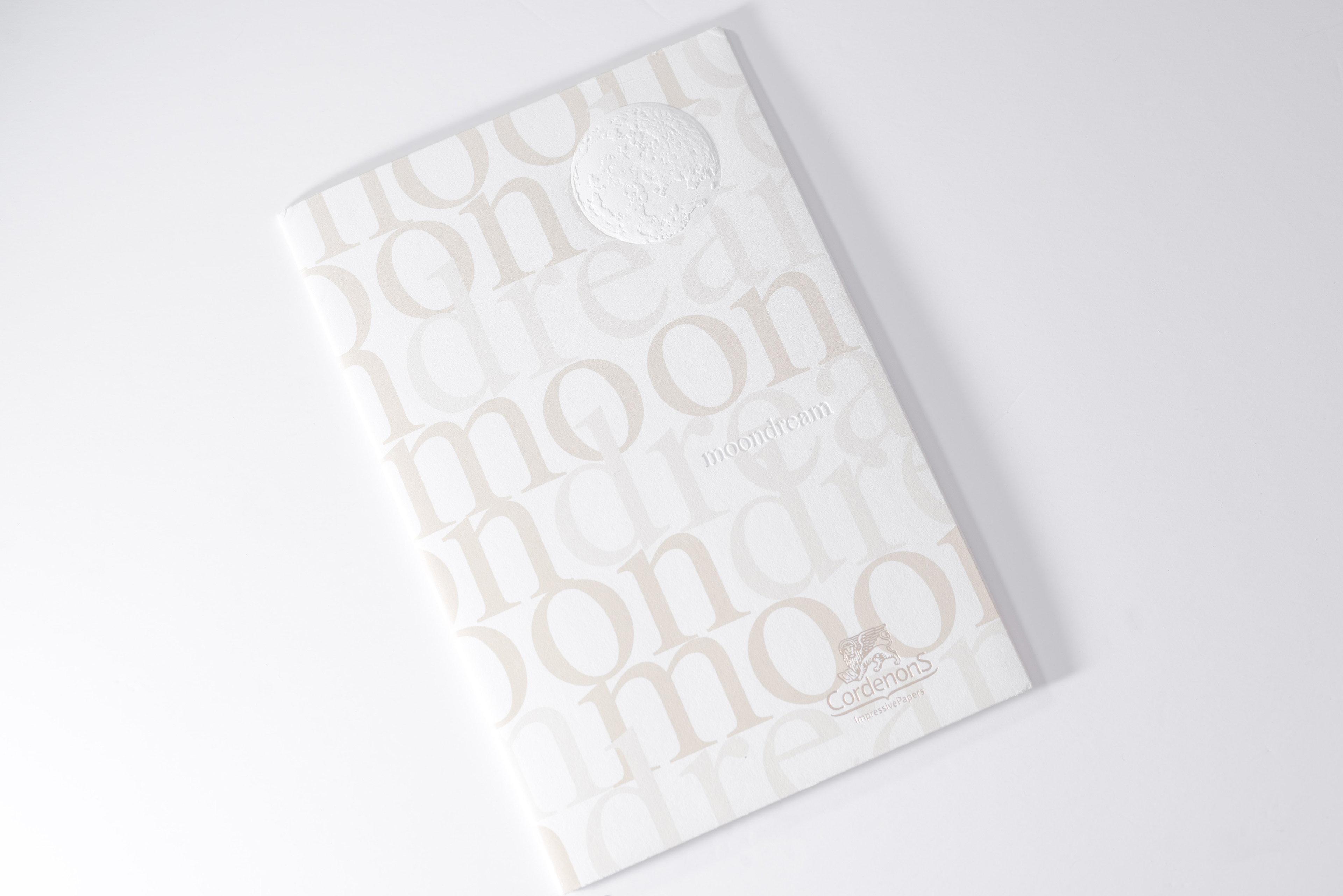
Located in Pordenone, Italy. Cordenons launched a product in 2010 with a very romantic name – “Moon Dream”
The cover uses 400gsm, white. White in Italian is “Bianco”; there is a smooth feeling when touching the surface of the paper,
and the texture is soft. It can be easily associated with any design that has a theme related to emotion.
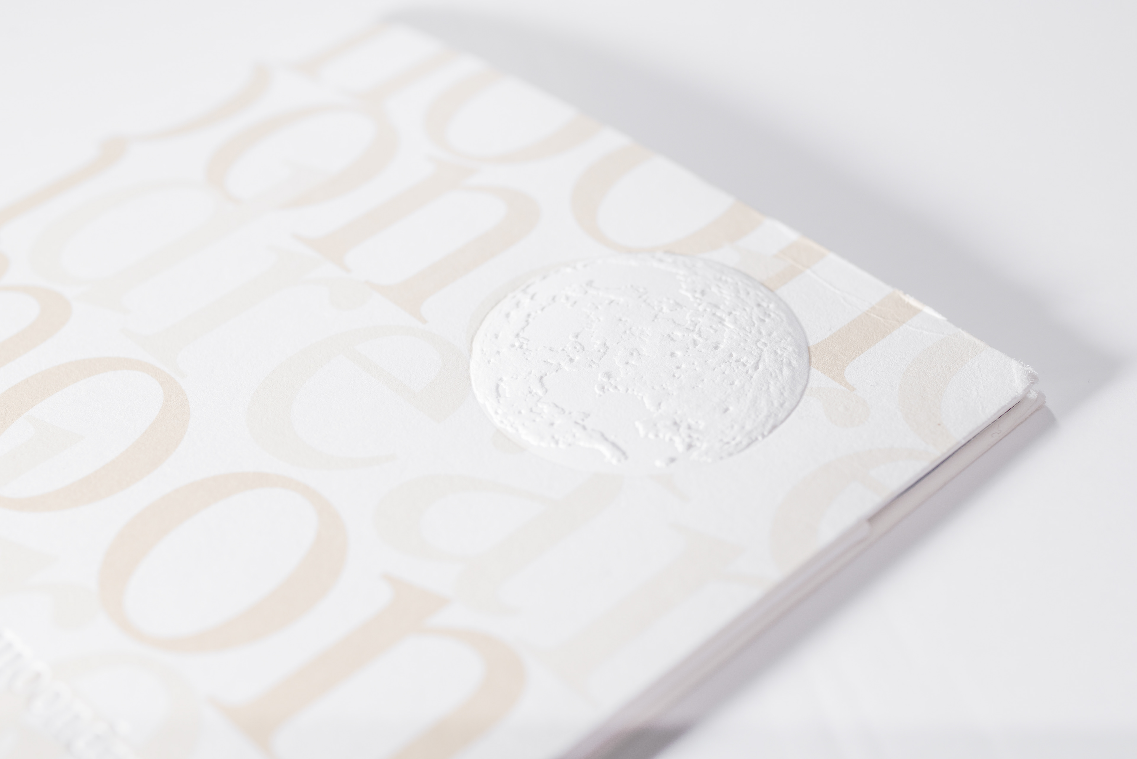
If a higher substance of paper is used, the effect of embossing can be controlled by the parameter pressure setting of the machine.
All these visual effects of the partial unevenness of the moon’s surface and the texture detail contrast with the cover image.
On the rounding shape or the sharp angle of the embossed font, imagine if such technique is applied to something similar to the image
of an architectural structure, it will also have an excellent effect.
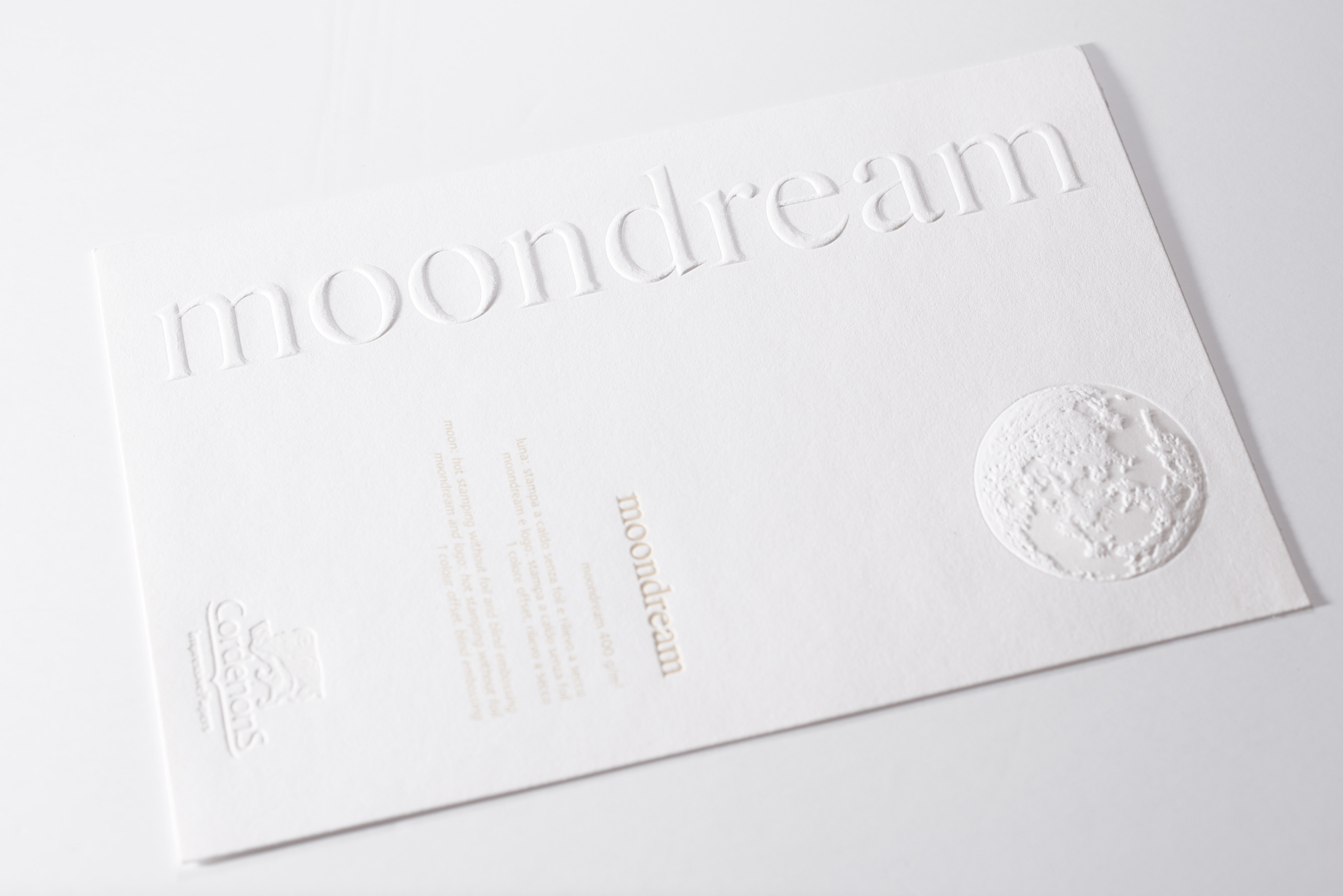
Four colour offset printing is used in this image. A special mention to “Moon Dream”, which is a type of paper that can undergo the hot foil technique. This means the paper melts under certain temperature, thus a semi transparent visual effect can be achieved. It is similar to the Takeo “Pachica” that was mentioned in the previous article, but each also has its own different advantages.
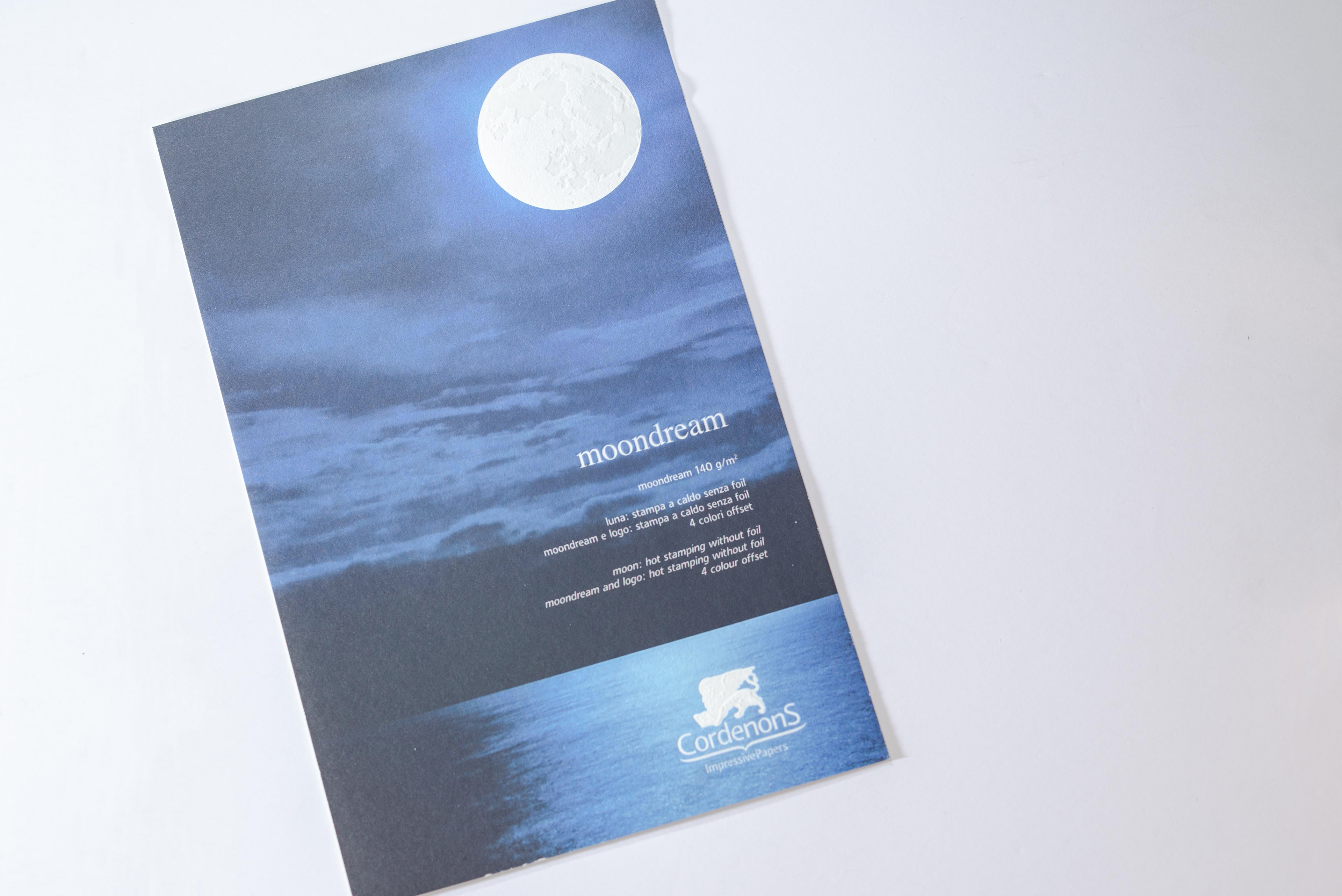
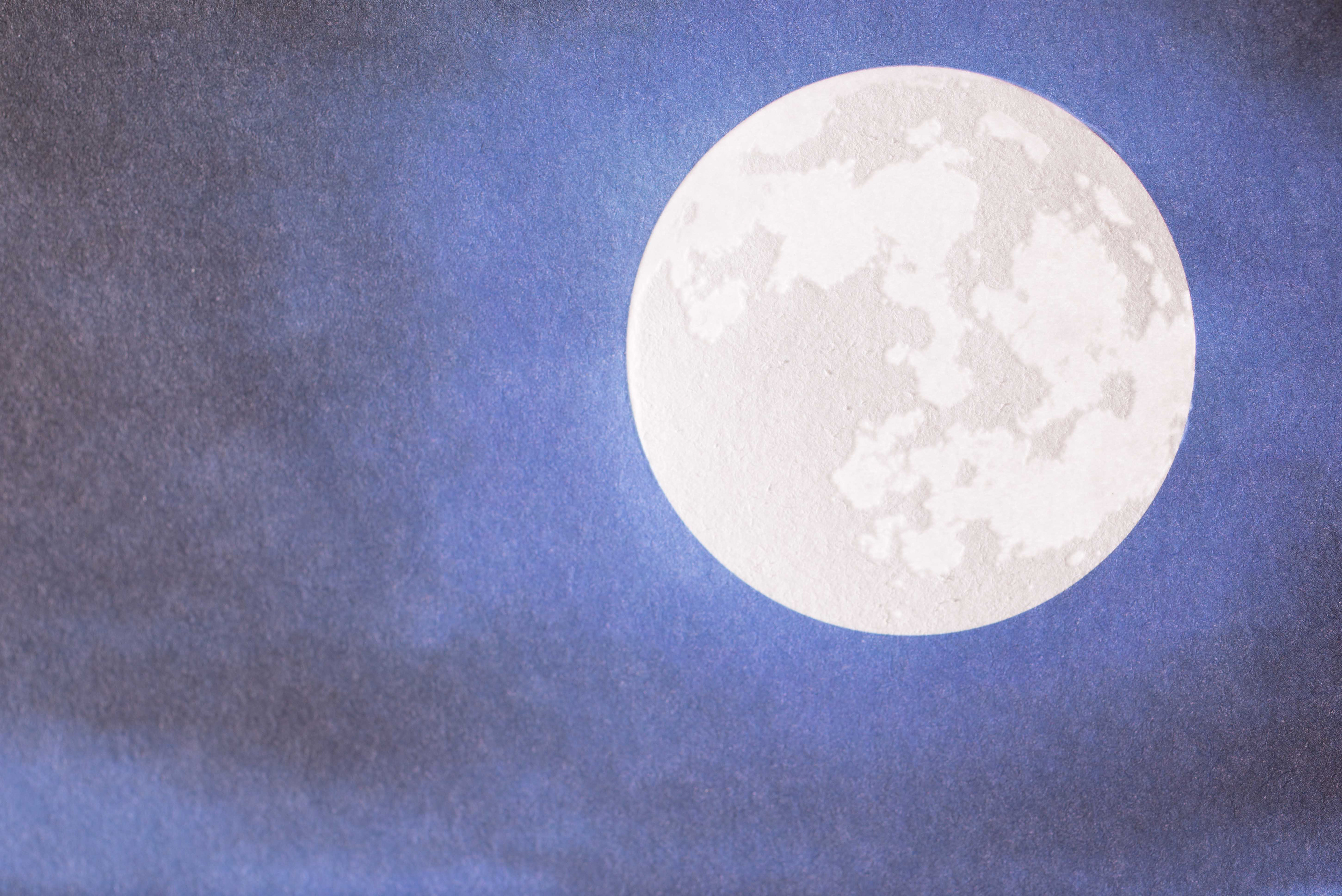
Finally using the effect of back light shooting, the semi transparent effect is created after the hot foil process.
By using the thinner 140gsm and hold it upwards in the air, it looks just like the moon shining in front of your eyes.
The Paper Institute has a variety of printing samples, but it is very rare to see a sample that consists of a “romantic” feeling element. Does it perhaps make us reconsider the definition of a printing product? And by bringing the design process back to the very starting point of conceptual thinking, using the Italian “Moon Dream”, it undoubtedly constructs a warm dream for the designers that are in love with paper.