This “Conqueror Annual Report Ideas Kit” is a printed sample made from Arjowiggins Conqueror. It is designed by the Singaporean company Siliconplus.
Mainly for the purpose of displaying the Conqueror paper, using a variety of printing techniques, this becomes an ideal product for expressing images for enterprises.
Mainly for the purpose of displaying the Conqueror paper, using a variety of printing techniques, this becomes an ideal product for expressing images for enterprises.
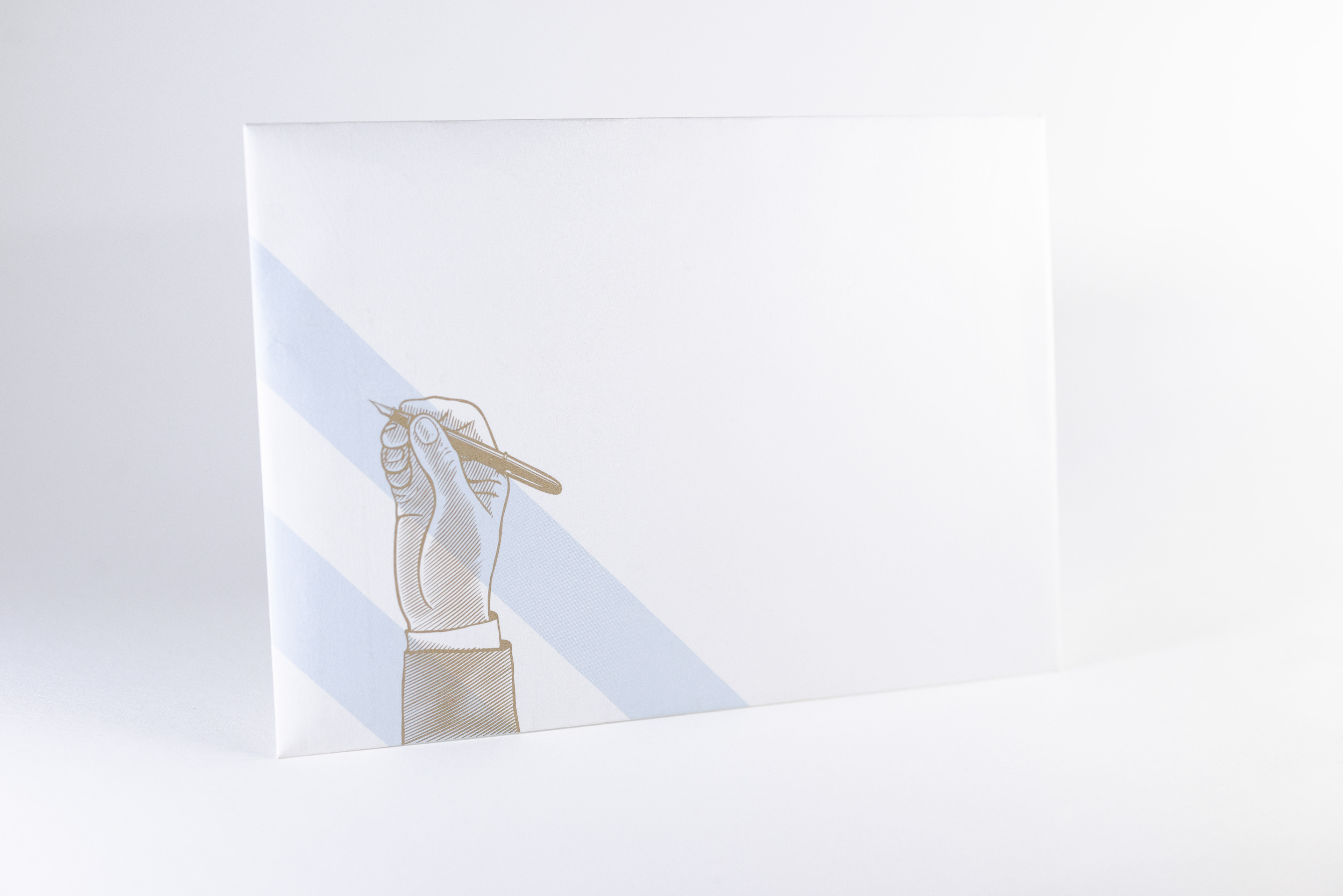
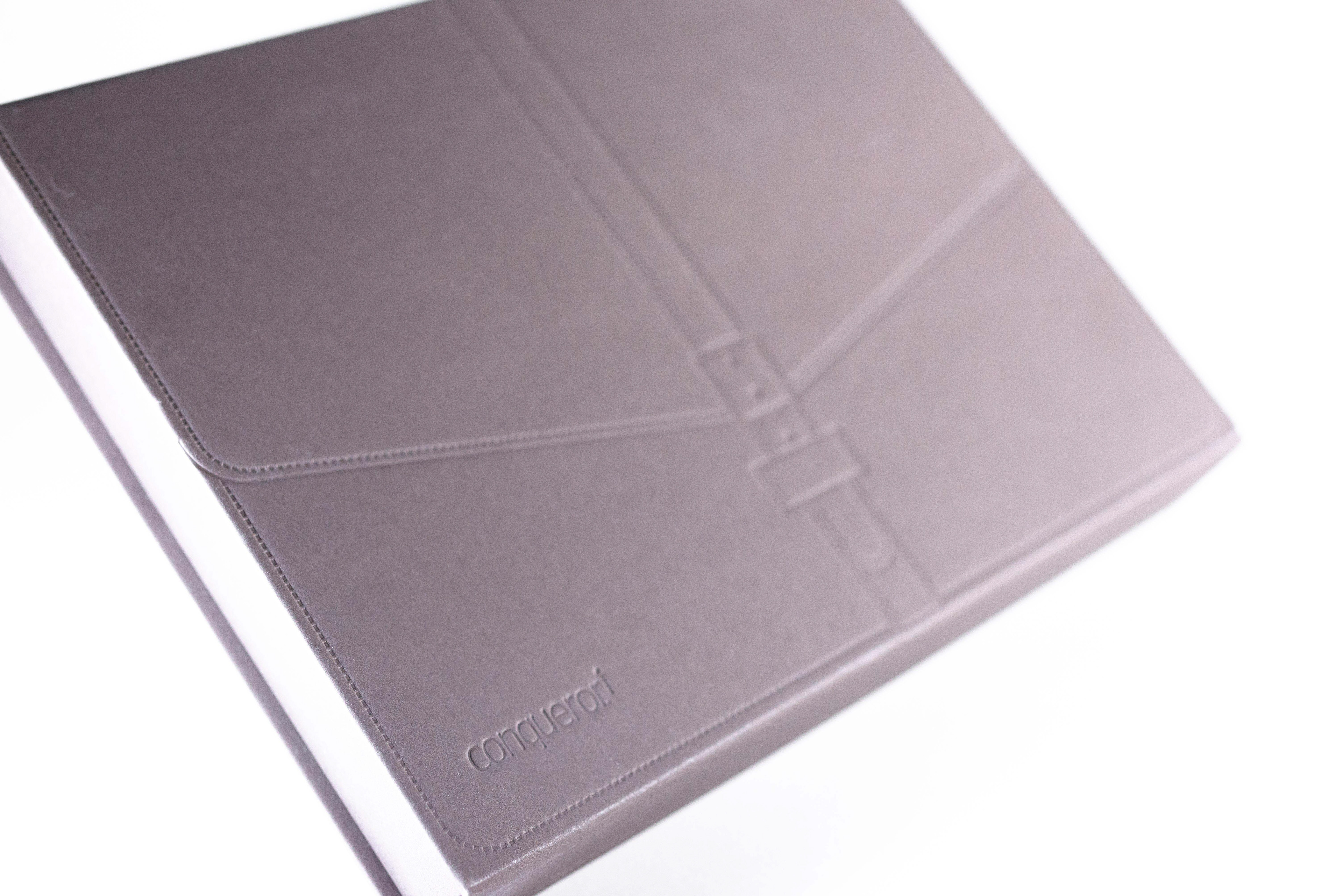
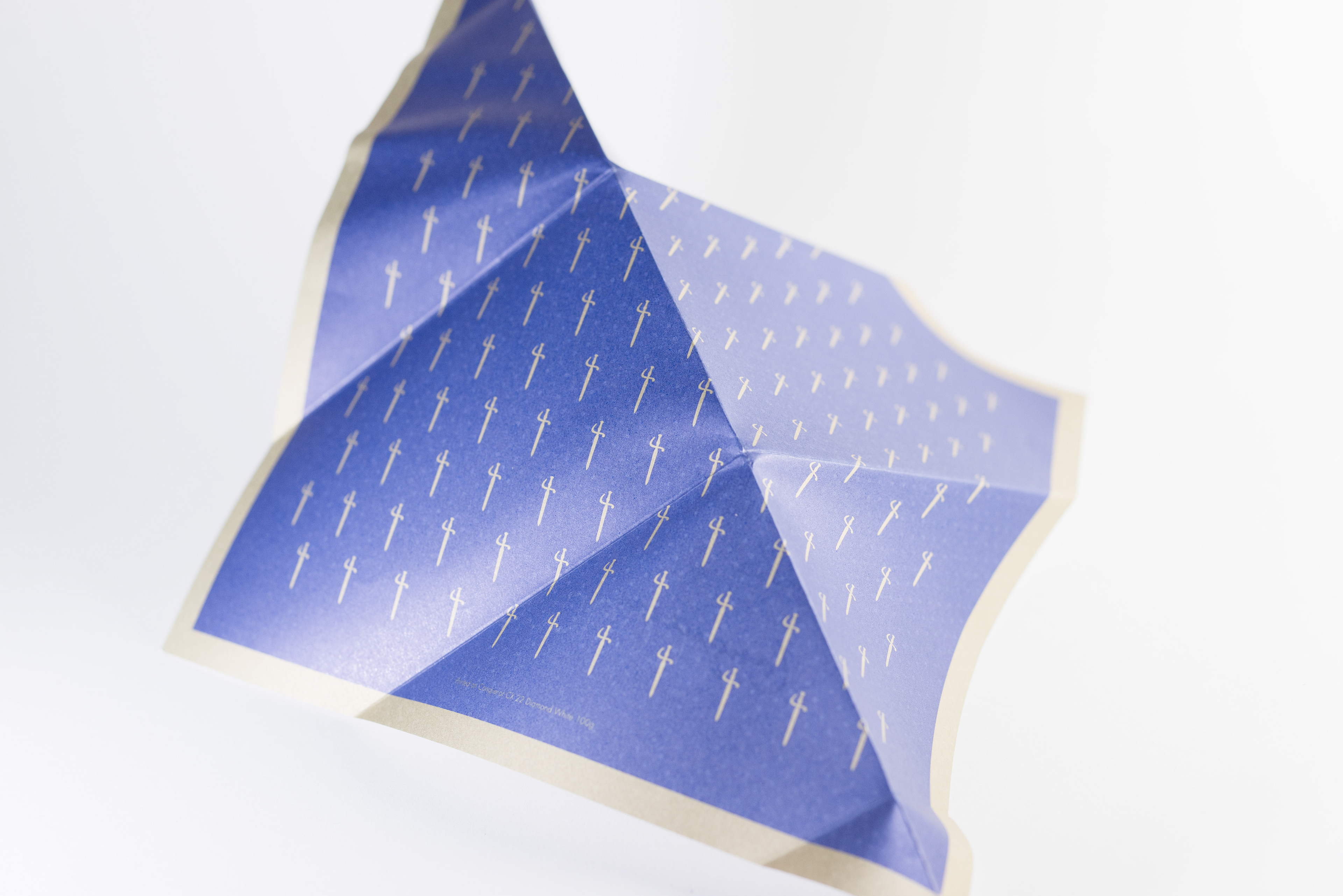
The surface of the envelope is made from the white Conqueror, which stands out from the traditional white envelope. It has a smooth touching feeling.
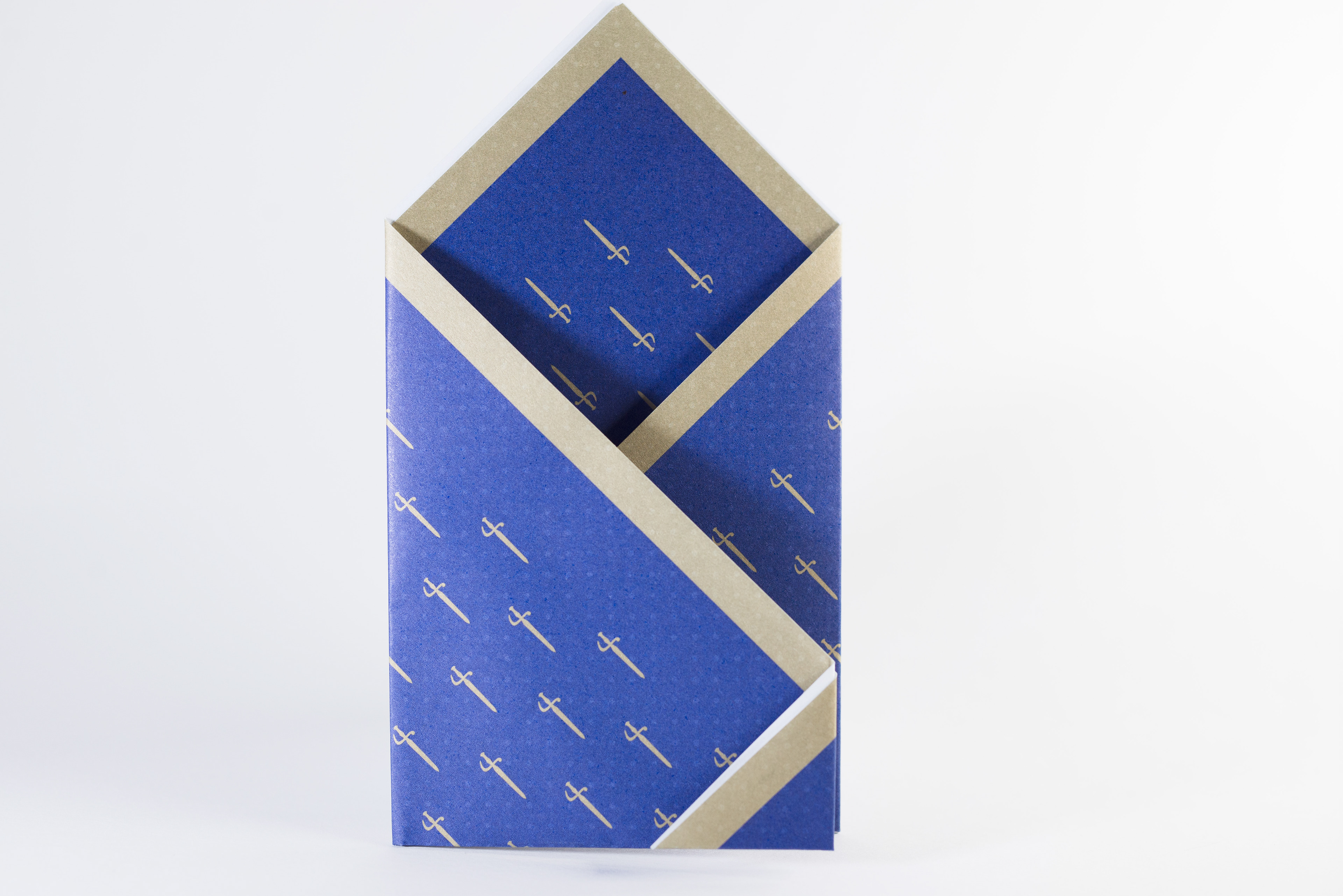
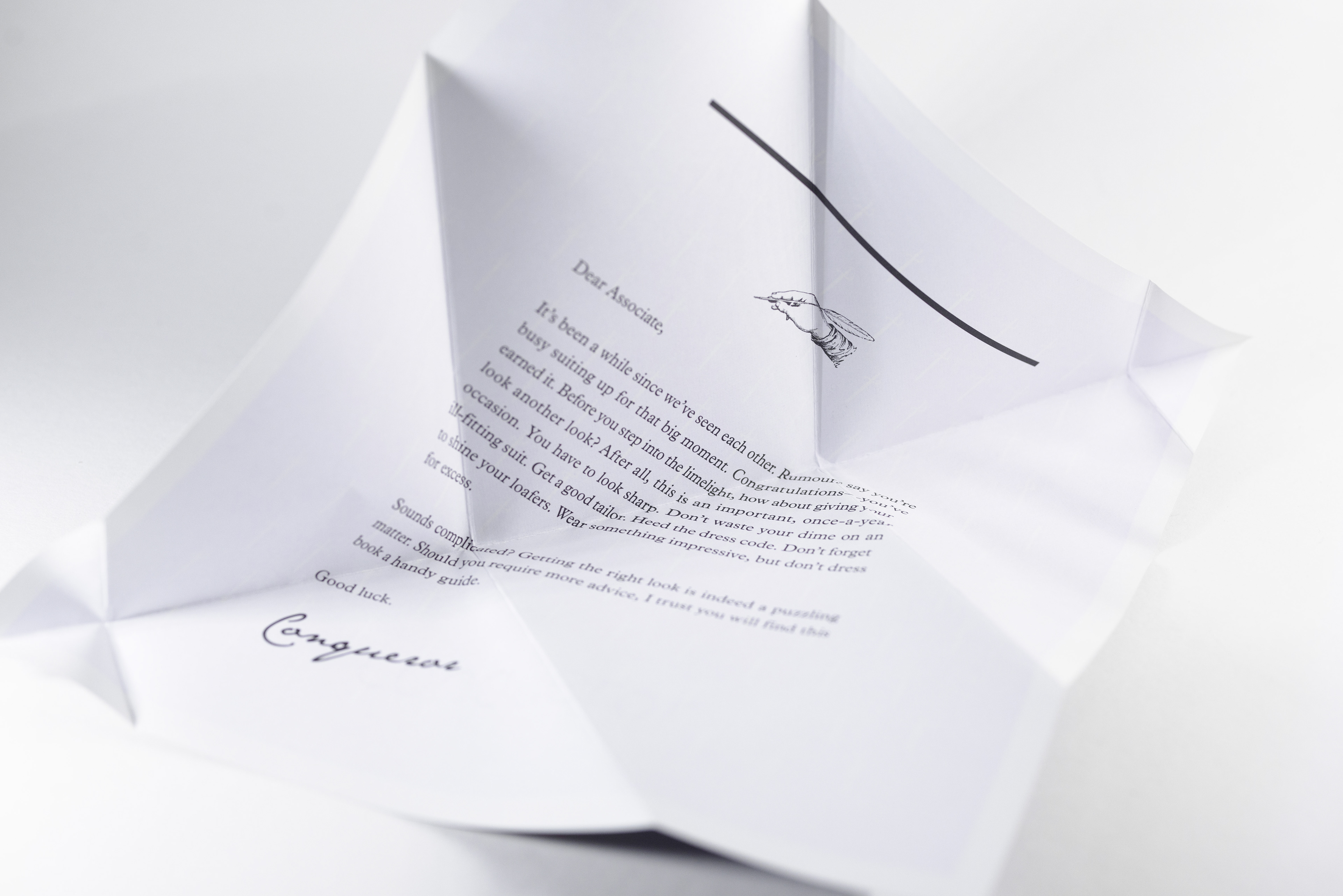
This letter paper uses double-sided printing and a special folding technique. Although the exterior uses more Cyan printer ink, the Conqueror series usually has very good user feedback. Apart from its history in Europe, this is also the reason it has been broadly used.
Perhaps because the details of the letter could unintentionally be seen by an unrelated third person through lights, therefore for “privacy” reasons, dark colours are applied on the modern day envelope interior and the letter paper.
However in the instances where the cost of mailing is measured in weight, even though there is variety of paper substances available for envelopes, for the companies that has frequent mailing requirement, this may not be a good value for money option.
However in the instances where the cost of mailing is measured in weight, even though there is variety of paper substances available for envelopes, for the companies that has frequent mailing requirement, this may not be a good value for money option.
I once tried to imagine, if my company has an important event that needs a delicate invitation card. This envelope has already made a very good proposal for a prudent but uncompromised elegance guest invitation.
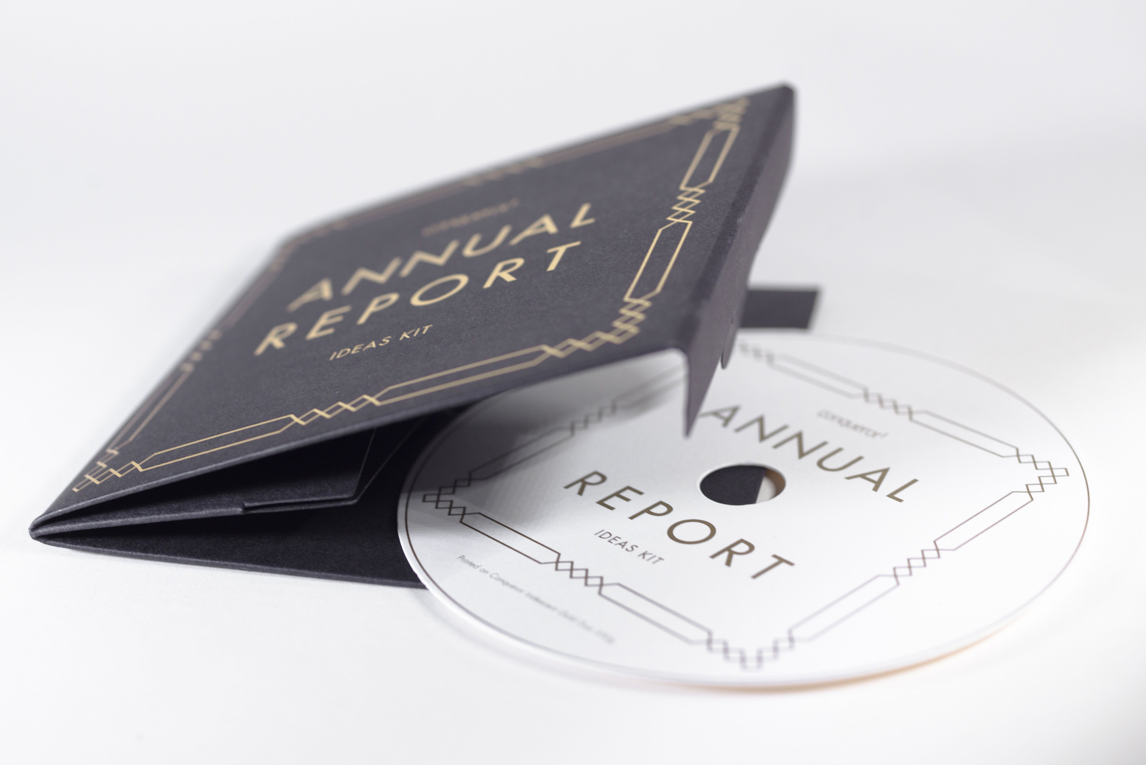
This is a CD case made from “Wove” of the Conqueror series. In fact other than the frequently seen plastic packaging, paper and printing perhaps allows more applications in theme design presentation.
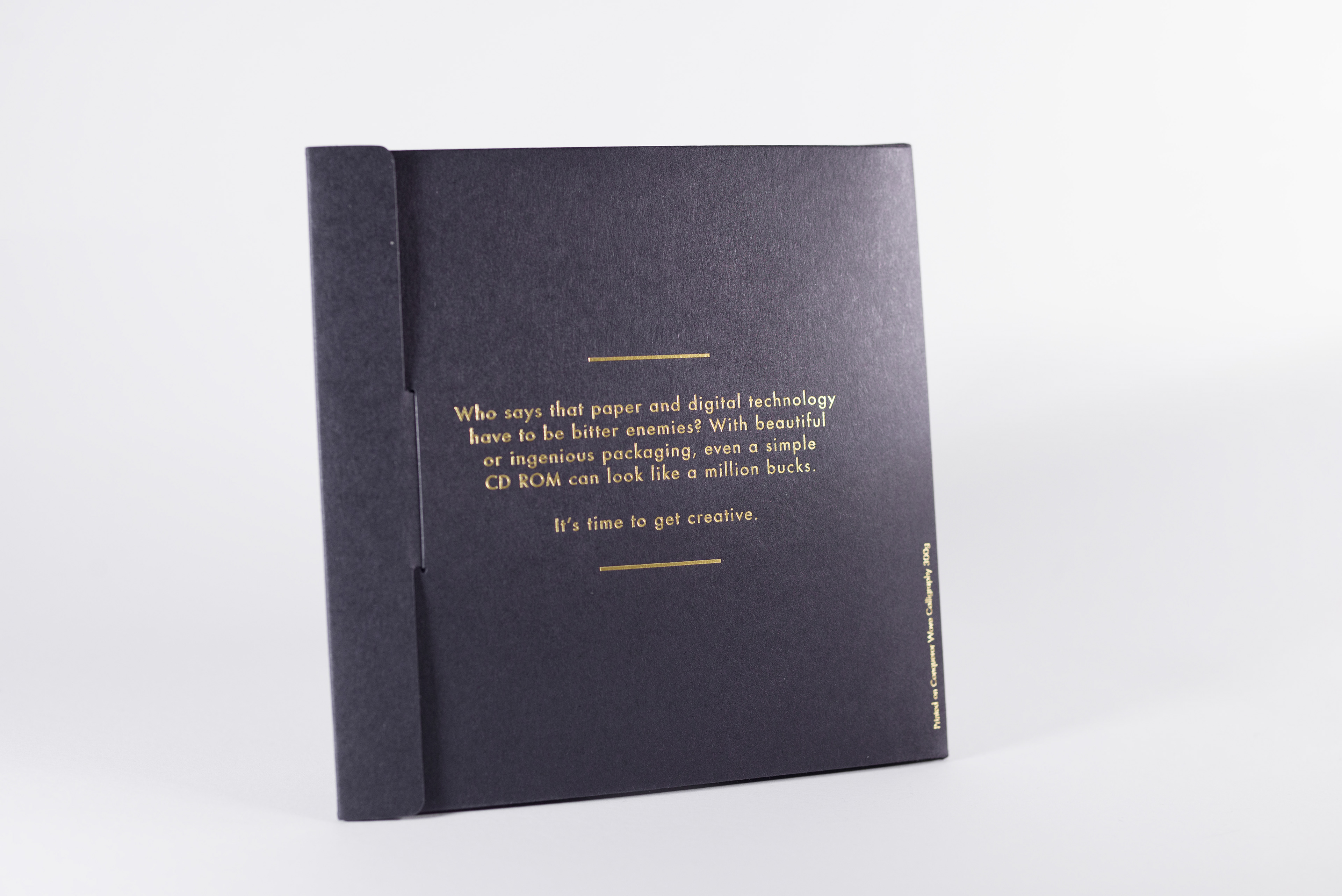
Who says that paper and digital technology have to be bitter enemies?
With beautiful or ingenious packaging, even a simple CD-ROM can look like a million bucks.
It’s time to get creative.
With beautiful or ingenious packaging, even a simple CD-ROM can look like a million bucks.
It’s time to get creative.
For packaging design, what do we need to present and express? And what value does it represents?
I believe these questions are worthwhile for every single designer to consider.
I believe these questions are worthwhile for every single designer to consider.